
Vee’s IV Therapy
This client is a local small business based in Melbourne’s northern suburbs, offering IV drip therapy services. They approached me with a clear vision for their brand and were looking to bring it to life through a distinctive logo.
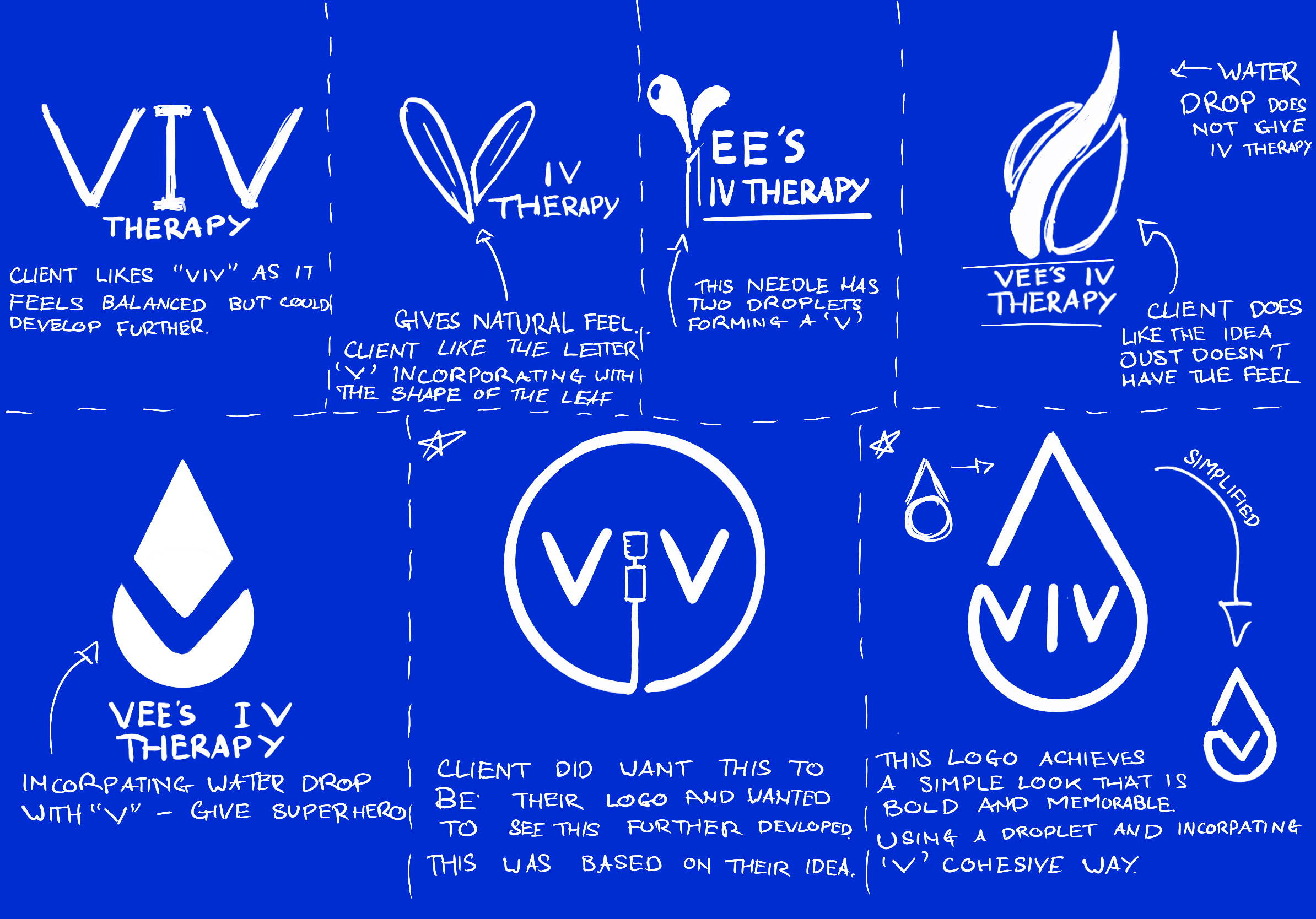
The brief focused on creating something simple, memorable, and instantly reflective of their brand identity. I explored several initial concepts, translating their ideas into visual form, and presented a range of directions. From these, the client selected two standout concepts to move forward with to develop further in.
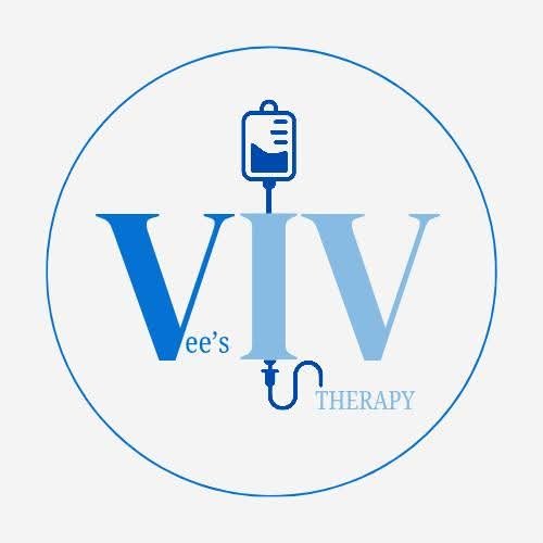
The client originally had this in mind for their logo.
They had me develop the idea further to come up with a high-end result to see if there was potential in this logo to be their identity.
Clients Idea
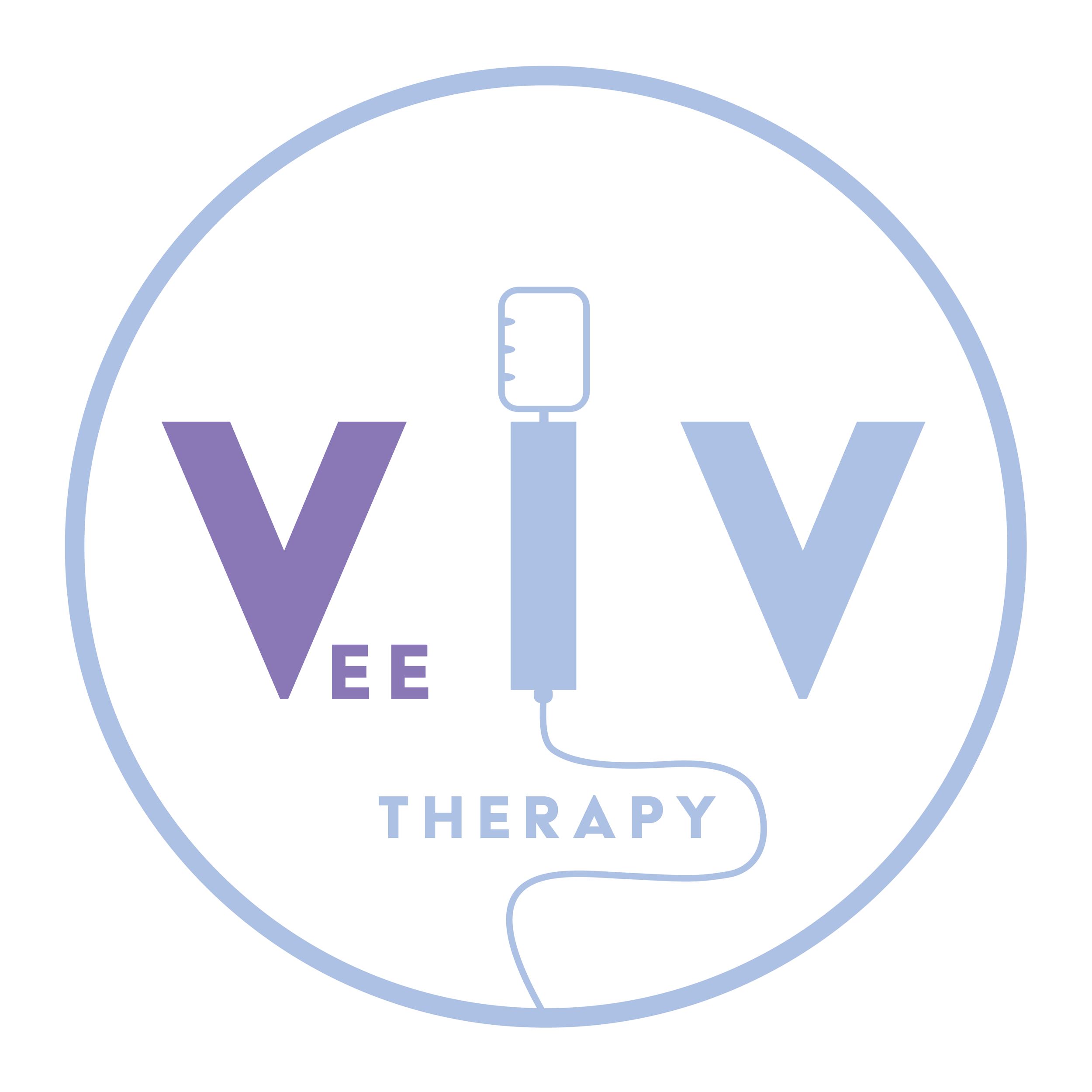
The client responded positively to seeing their concept brought to life in Adobe Illustrator, particularly the emphasis on their name within the design. “Vee” was highlighted in a darker tone (#8B78B7), creating contrast and drawing focus, while the supporting elements were developed using a softer complementary colour (#ADC1E4).
During the refinement process, it became clear that the design’s finer details affected its legibility at smaller sizes and from a distance. Given the importance of clarity across digital and real-world applications, I guided the client toward considering a more simplified alternative that would better maintain visibility and impact.
Clients Idea
Final
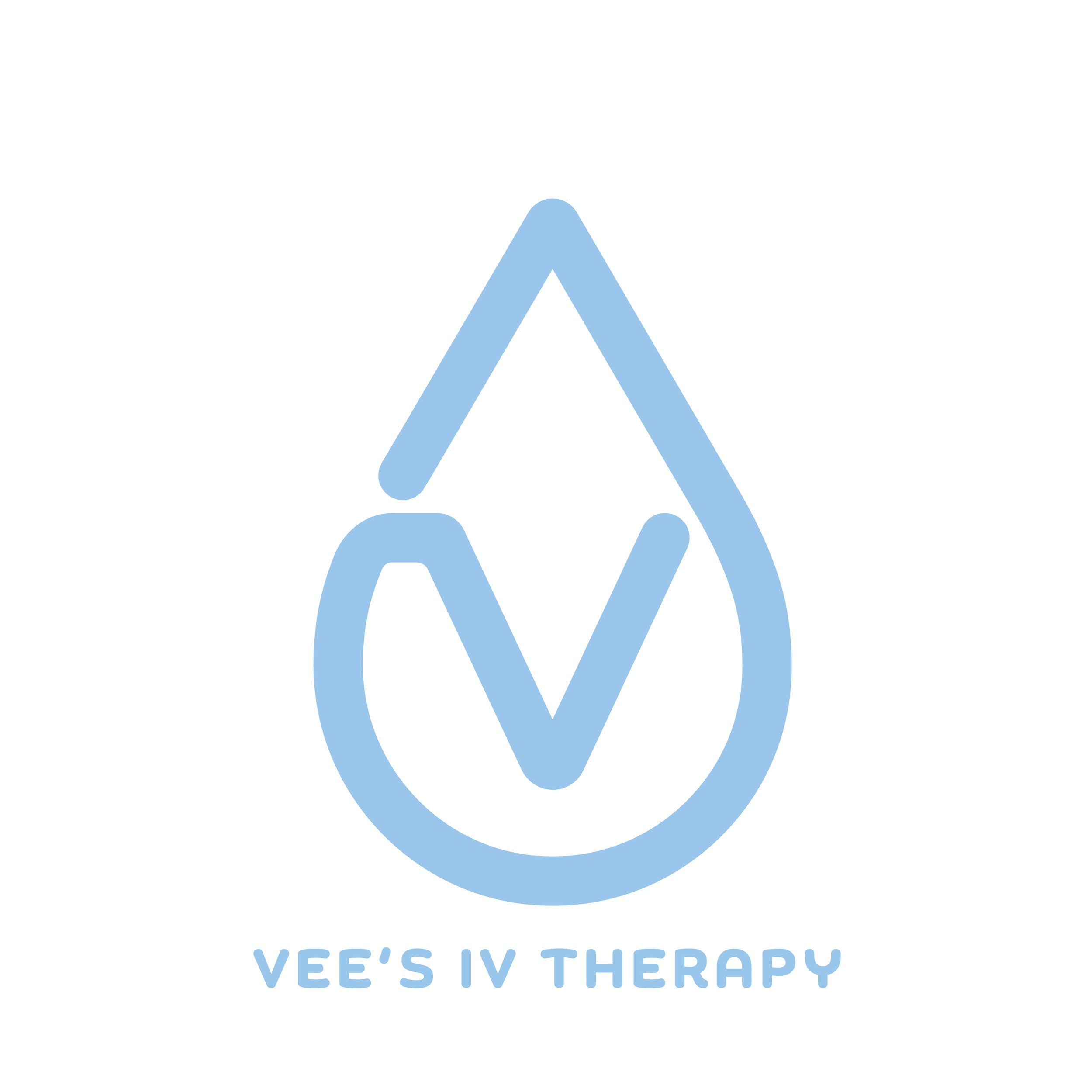
The client ultimately selected this concept, drawn to the integration of a water droplet forming a subtle “V” shape, representing the brand name. This detail created a clean, meaningful visual connection to the service while maintaining a simple and memorable identity.
The chosen colour, #98C7EB, introduces a calm and clinical tone that aligns well with the nature of IV therapy. For typography, the client selected the Chennai font from Adobe Illustrator, complementing the overall aesthetic with a modern and approachable feel.
The logo was designed with versatility in mind, ensuring it performs effectively across digital platforms, particularly on mobile and social media. It functions both with and without accompanying text, maintaining clarity and recognition in all formats. Its bold, simple construction ensures strong legibility at various sizes and distances, staying true to the client’s original brief.